Quantcast Brand System
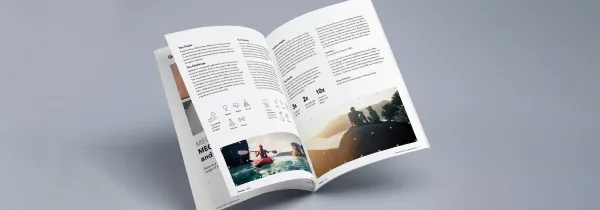
I maintained the Quantcast brand system over five years, keeping logos, type, color, and graphic language consistent across products, websites, and marketing collateral. The job was as much about collaboration as it was about design — partnering closely with product to keep brand and product feeling like one company.
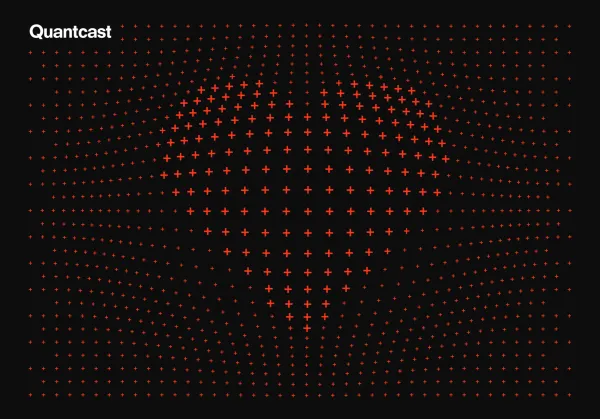
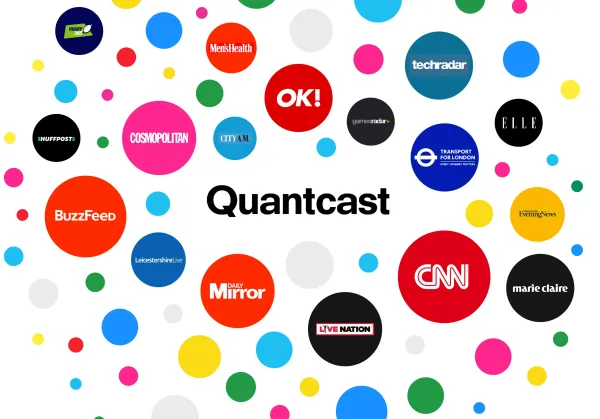
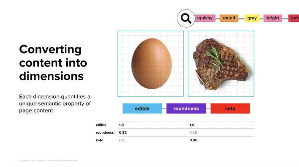
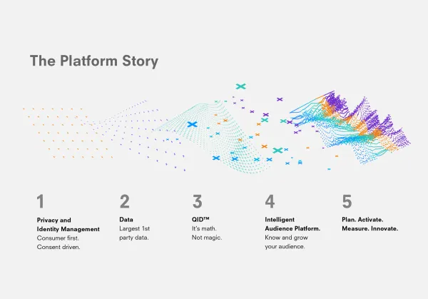
The brand's visual surface changed substantially over that time, but a few things stayed constant: bold Swiss typography, a structured grid that nodded to the science and data behind our products, and a focus on making complex audience data feel approachable.
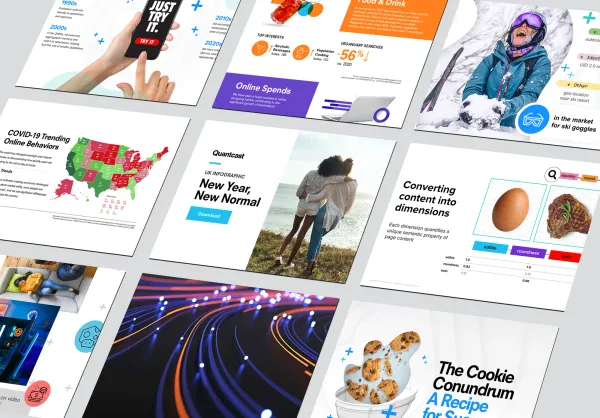
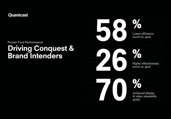
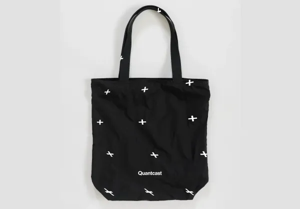
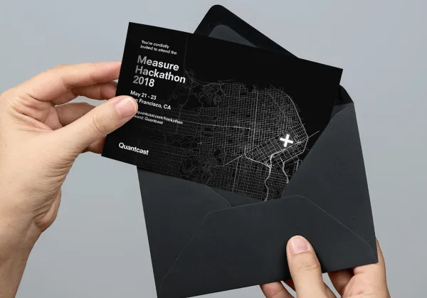
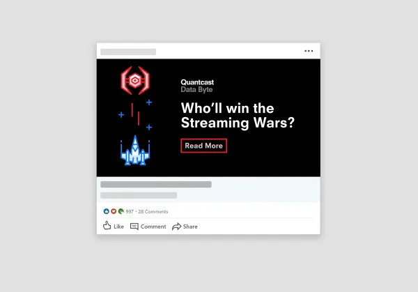
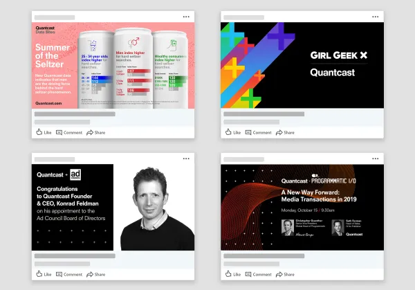
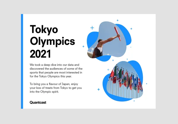
I joined the Marketing Design team right after an agency-led rebrand. Our first job was to roll the new identity out across every surface — print, swag, event collateral, ad creative — and make it feel native to the brand rather than bolted on.
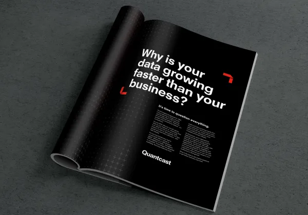
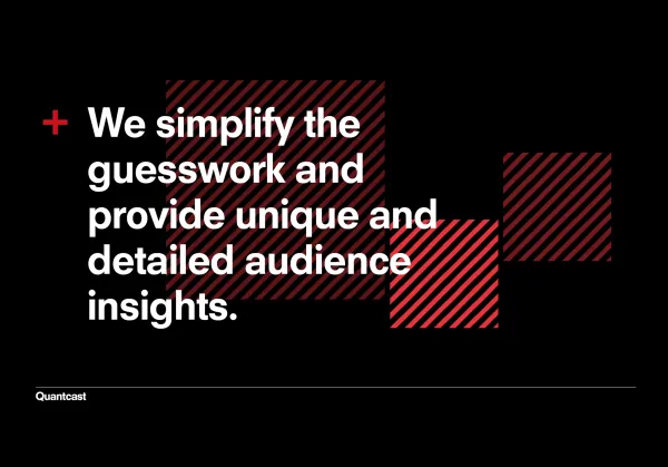
After our CMO and Creative Director both departed, the three remaining brand designers became the final decision-makers on anything brand. I stepped into leading the team day-to-day, with a clear set of goals: lighten our layouts to counter the "black box" perception of AI decision-making, and tighten the connection between product design and marketing design.
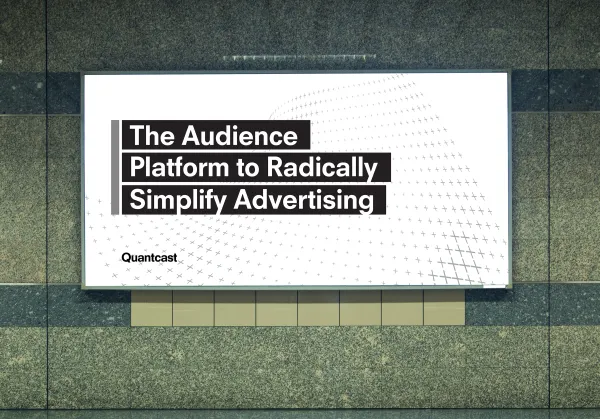
Three designers, no creative director, and a brand that couldn't afford to wobble.
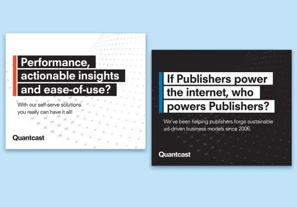
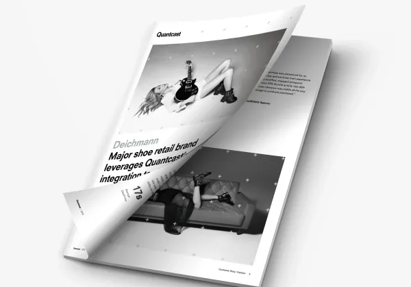
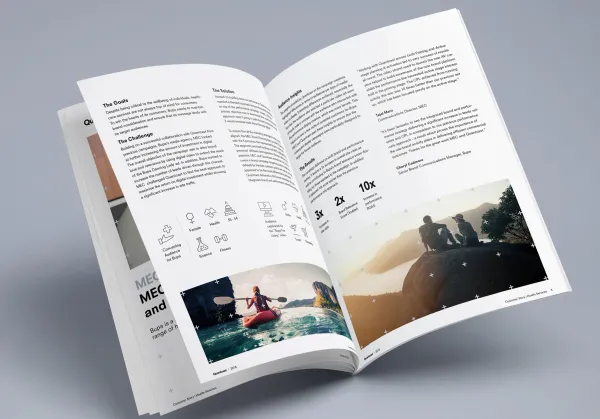
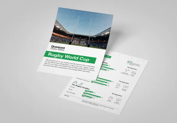
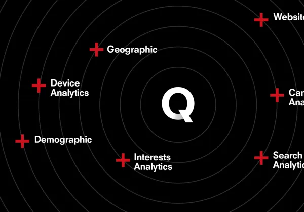
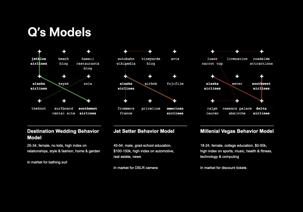
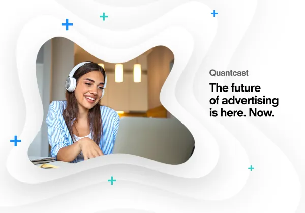
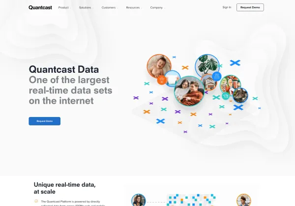
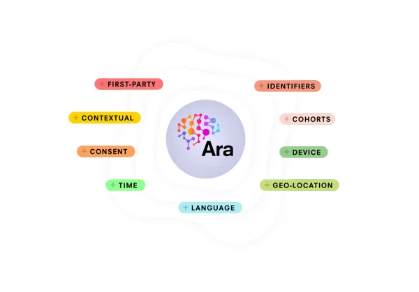
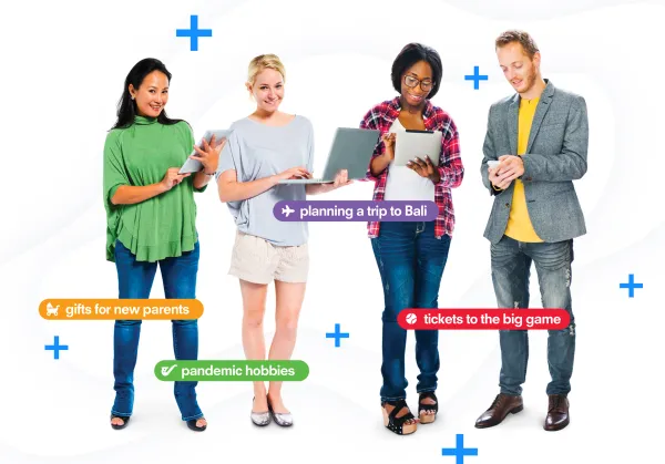
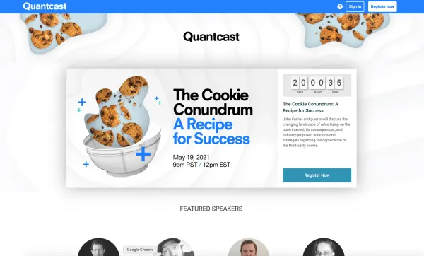
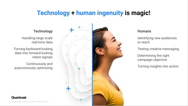
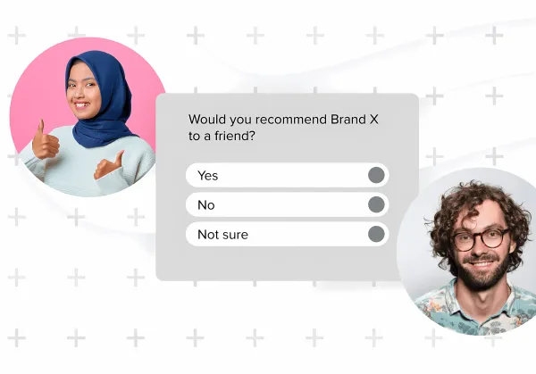
A new CMO arrived wanting a brand refresh. We pulled it off internally in four months, timed to coincide with a livestreamed self-serve platform launch and a major website update. The refresh leaned into more of our color palette, swapped vague data-pattern imagery for human-centric photography, and introduced a system of shape-driven background visuals to give layouts more rhythm.

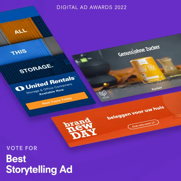
We were nominated for a Digital Ad Award and ran an internal vote-rallying campaign — silly, animated, on-brand.