Presentations
I design presentations that have to do real work — internal kickoffs for thousands of employees, recruiting decks, partner-facing webinars, and C-suite narratives. The brief is almost always the same: take something complex, give it a clear visual hierarchy, and make a 60-slide deck feel like one piece of thinking instead of forty.
My approach leans on visual hierarchy, considered typography, and data visualization to keep dense material readable. The collaboration with stakeholders is the part that makes or breaks it — getting the message right before the design ever starts.
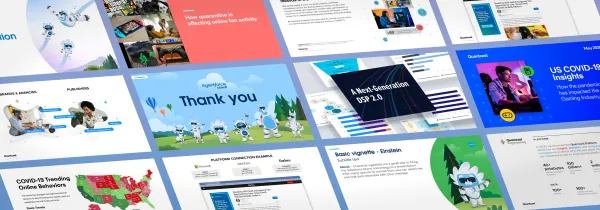
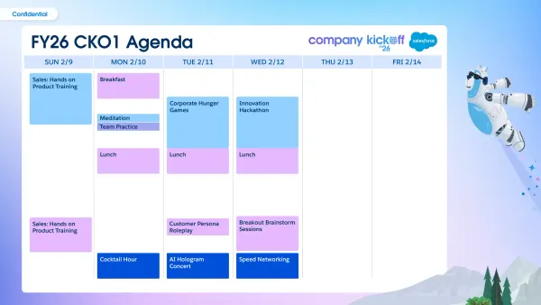
Title moments, agenda system, and card-based content blocks for a kickoff event spanning thousands of attendees.
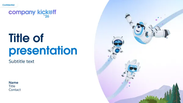
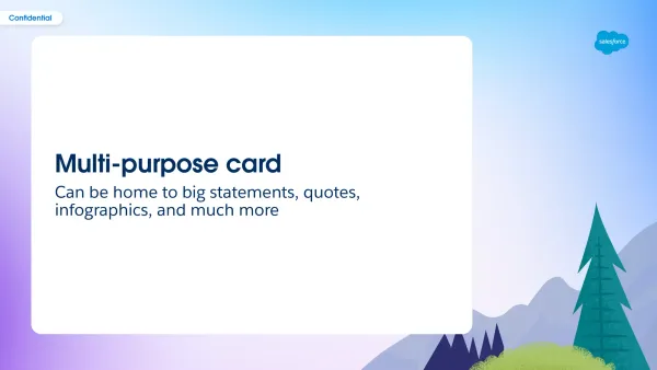
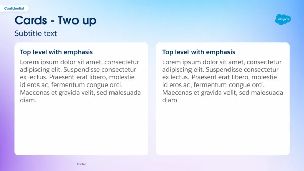
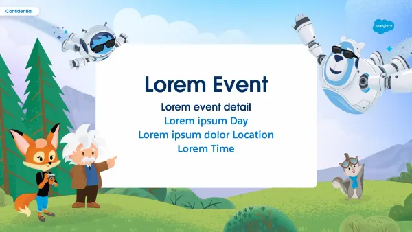
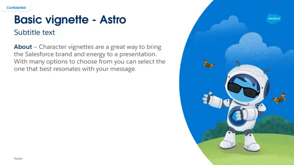
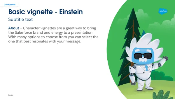
Continuing the kickoff system into a later edition, with character vignettes (Astro, Einstein) tying back to the broader Salesforce brand language.


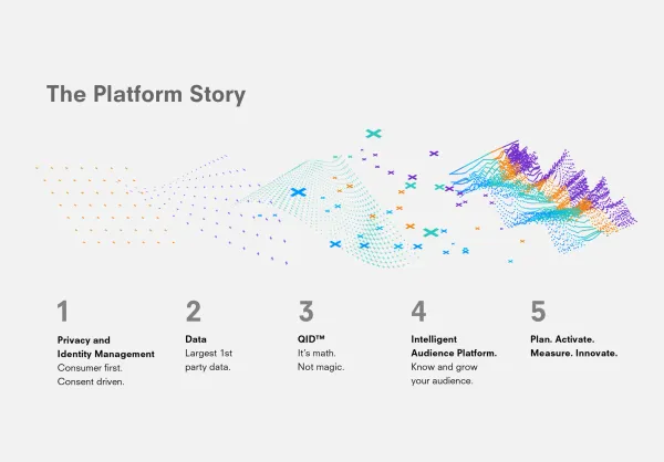
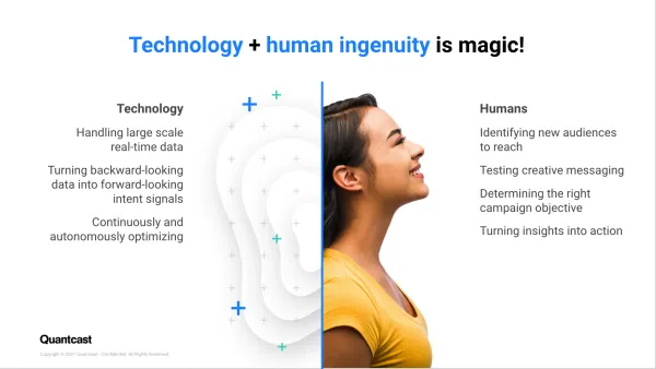
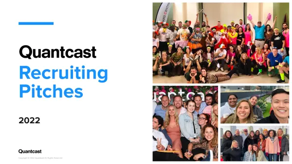
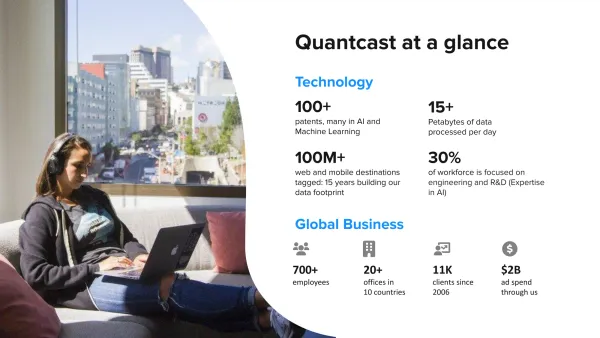
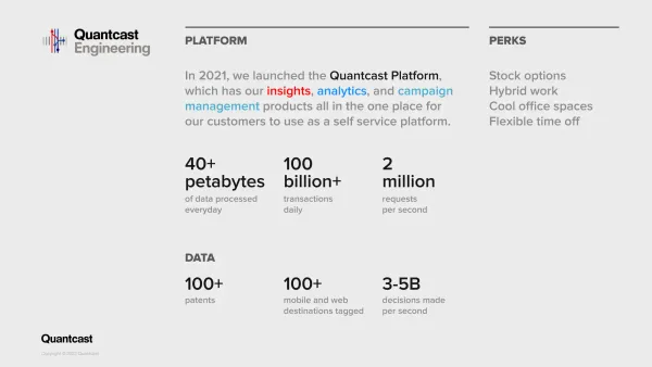
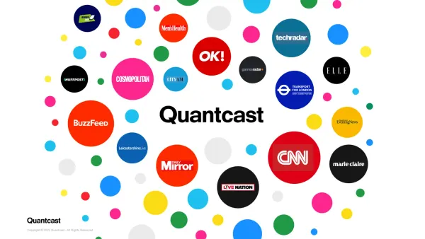
A recruiting pitch deck that introduces the company at a glance, then progressively unpacks the platform, products, and engineering side for candidates.
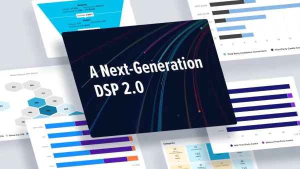


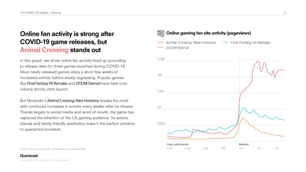
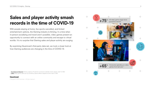
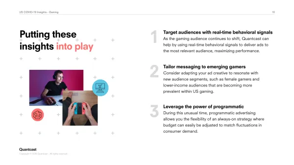
A partner-facing webinar deck on gaming audiences — narrative-led, with custom data visualizations to support each behavior trend.
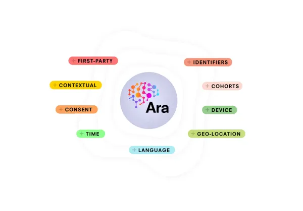
An internal strategy deck framing the company's big bets for the year ahead — abstract concepts (algorithmic shifts, the marketing flywheel) made tangible through illustration.

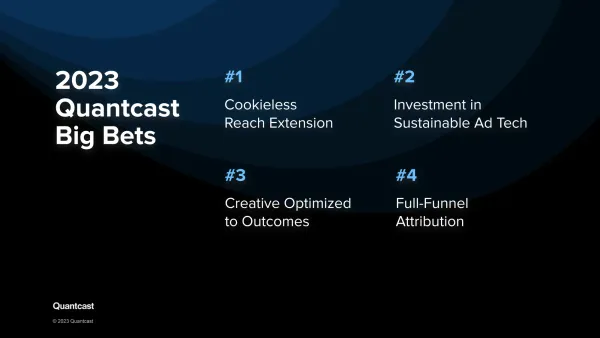
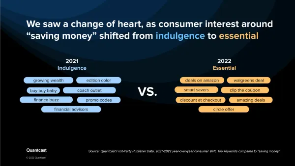
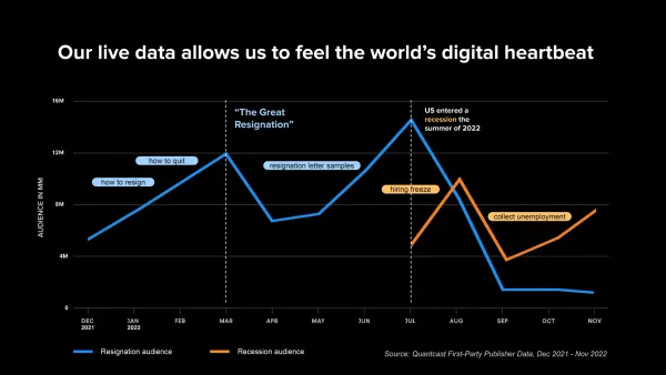
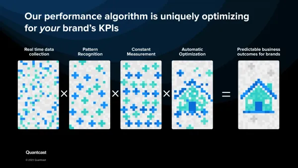
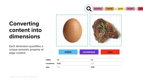
The recurring challenge across all of these: take something dense — AI engines, audience signals, platform architecture — and make a single slide carry it. Sketches and concepting up front are what get this past "it's accurate but unreadable" and into something people actually remember after the meeting.